The design story
The palette appears at several scales, from small chair accents to tall aisle arrangements and reception centerpieces. Trailing greenery connects the flowers to the draped stage, while blue place settings give the softer rose tones a clear counterpoint.
Blue appears as an accent with real purpose, interrupting the blush and ivory rather than replacing their softness. Small chair flowers reveal the palette at close range; taller arrangements lift it into the long aisle views. Open metallic stands and trailing foliage keep the large pieces from becoming solid blocks of color. At the draped focal setting, the flowers add shape around the pale fabric, while blue napkins bring a stronger note to the reception tables. The contrast between delicate flower color and clearer textile color gives the collection its particular character.
Try using your accent color at different strengths. A few blue flowers can soften a blush arrangement, while a more saturated napkin makes the same palette readable across the room.
A closer look


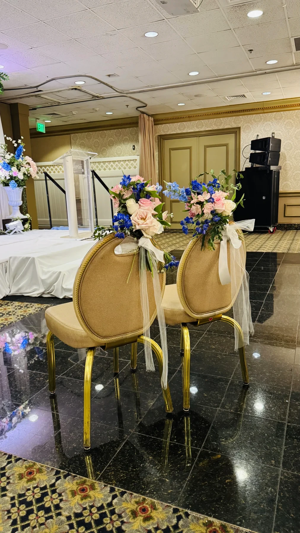


Open a photograph to explore the flowers and finishing details.
Make it your own
Bring your favorite colors and shapes to a conversation about your celebration. Tell us about your floral vision, or explore more design collections.